I designed essential UI elements and partnered with the UX team to refine flows and hierarchy, ensuring that complex surveillance operations became more intuitive and efficient for enterprise operators.

UI/UX Designer
Team|Wen-Chun Chen (Lead), Yu-Feng Huang, Verna Hsu, 5 Development Engineers
Design Guideline
Specification & Handoff
Component Library
Dec. 2020 - July 2023
Overview
—
VORTEX had an established design language on web.
Mobile was a new territory.
As VORTEX expanded into mobile, the team needed a new component foundation for the platform. I took on the challenge of defining that foundation while keeping the experience aligned with VIVOTEK’s broader design system.

The challenge was deciding how the system should translate to mobile.
Reuse
What could carry over?
Identify which existing patterns and visual rules could translate directly to mobile.
Adapt
What needed to change?
Adapt components and interactions for smaller screens, touch behaviors, and mobile-specific states.
Extend
What was missing?
Define new components and patterns for mobile needs that the existing system didn’t cover.
I owned the mobile UI from system definition to implementation.
I owned the UI design for VORTEX mobile, translating the existing VIVOTEK design system into a mobile component library across light and dark themes. I worked closely with UX, engineering, and QA from design definition through implementation.

Adaptive
Monitoring
—
A monitoring panel had to balance two competing needs.
Operators needed quick access to playback controls and camera information, while the live feeds had to remain the visual priority. On mobile, every control added to the panel reduced the space available for monitoring.
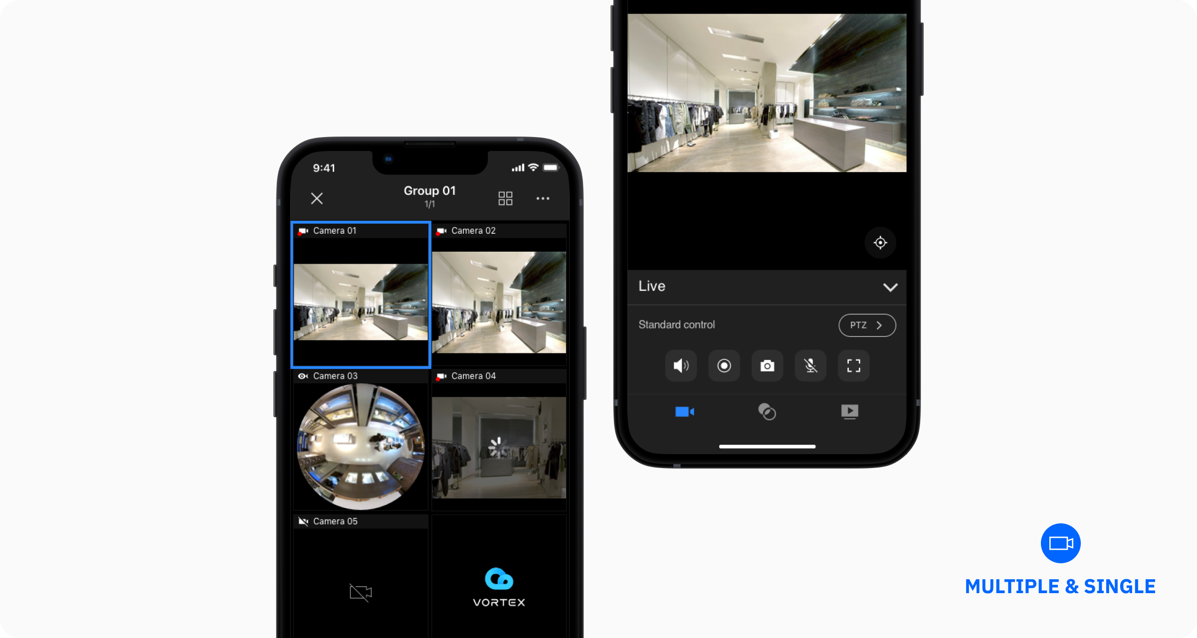
Then the requirement expanded to 16 channels.
We originally designed the monitoring screen for up to 8 camera feeds. When the requirement doubled to 16, each camera view became much smaller, especially on the smaller Android devices many of our users relied on.

Every pixel started to matter.
I revisited the hierarchy to reclaim space.
I explored which information needed to remain prominent and which could be made more compact. After exploration, I decided that camera names were still necessary, but they didn’t need the same visual weight at higher channel counts.
I changed from Body to Caption, reducing the space each stream required while keeping names readable across dense layouts.

A smaller text style gave the video more room.
The adjustment helped the same monitoring pattern scale from a few feeds to 16 channels on smaller screens.

Cross-Platform
System
—
One design system had to work across two platforms.
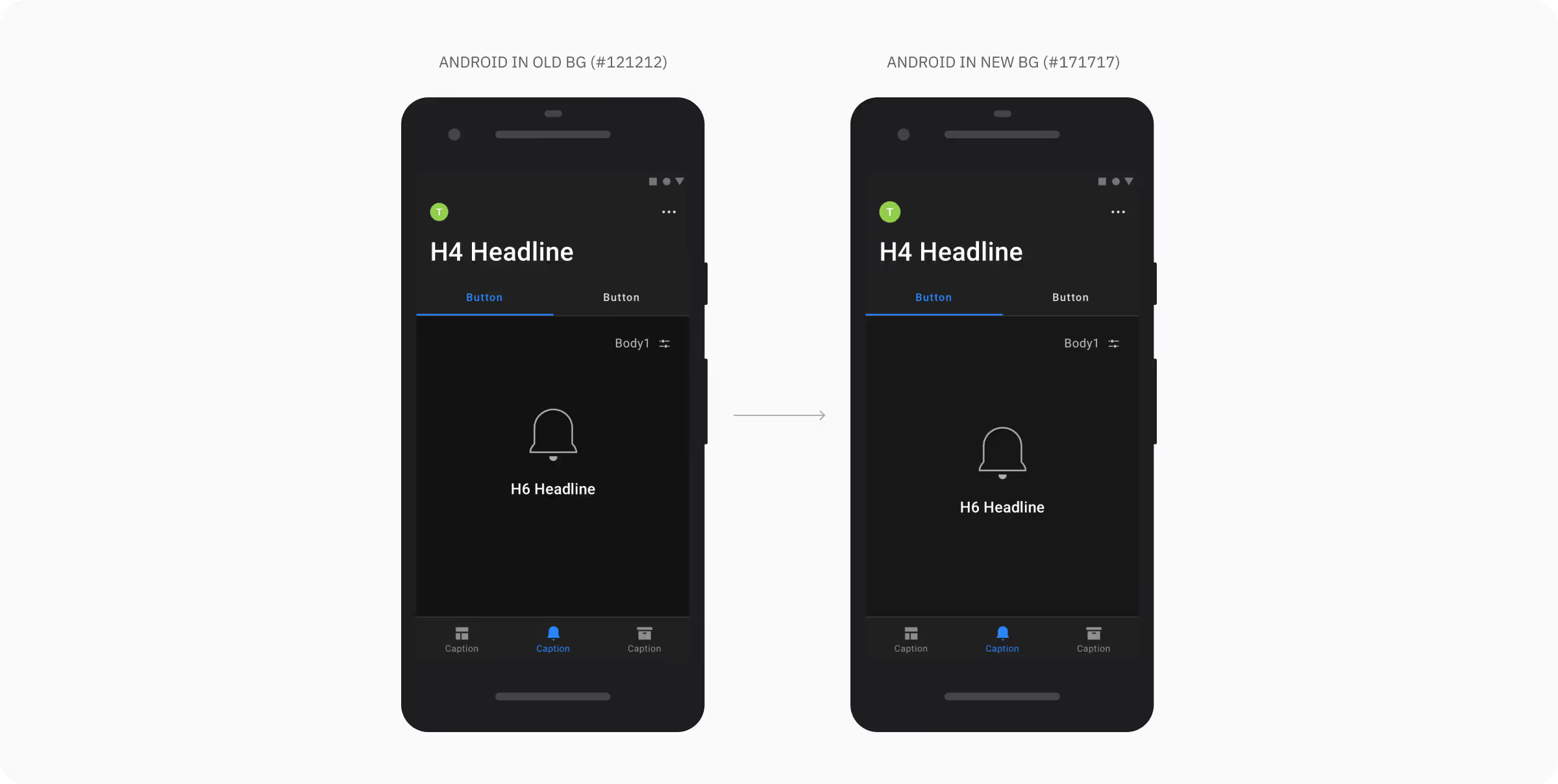
Initially, I defined a shared color system for VORTEX mobile to maintain a consistent visual hierarchy across iOS and Android. As the system moved into implementation, platform-specific patterns began to challenge that structure.

The same hierarchy didn’t always mean the same surface.
On iOS, modal stacking required an additional surface level that Android didn’t use. This meant elements at the same information hierarchy could end up with different surface tokens across platforms, creating confusion during development and QA.

I audited whether the extra layer was actually necessary.
I reviewed every screen using modal stacks and aligned with the UX team on their information hierarchy. I also worked with QA to validate whether users relied on color differences to understand the layers.

The modal structure already communicated hierarchy on its own.
The extra color layer added complexity to the system, but little value for users.
So, I removed a layer from the system.
I merged the iOS modal surface with the background layer, reducing the number of surface definitions shared across platforms. This gave iOS and Android a simpler foundation while preserving the hierarchy users already understood.


DEVICE
VARIABILITY
—
One layout rule couldn’t cover every device.
Sales feedback showed that many VORTEX users relied on smaller Android devices in the field. I used 360×640 as the lower-bound reference for Android, alongside our iOS baseline, and defined positioning rules so key elements could stay visually balanced across screen sizes.

But... the edge cases started to break those rules.

During implementation, older iPhones exposed gaps in the original grouping logic, while Android 12 introduced new splash screen constraints.
I started to map the device range before redefining the rules.
I audited the screen sizes we needed to support and grouped them by platform, from older iPhones to smaller Android devices. I also reviewed the new Android 12 splash screen guidelines to understand where each platform required different behavior.


I turned the edge cases into platform rules.
For iOS, I defined shared logo sizing and positioning rules that accounted for screen height, the home indicator, and newer display areas. For Android, I created a separate rule that followed Android 12’s splash screen behavior while still preserving the same VORTEX visual hierarchy.

Interface
Craft
—
A closer look at how the mobile design language came together across core flows, states, and interactions.


Take away
—
Reflection

Designing for the edge cases changed how I think about systems.
I learned to treat edge cases as part of the system, not exceptions. Designing from the smallest supported Android screen helped me create rules that held up across different devices and platforms.
Next Level

The improvement of the mobile library
First, the naming structure of components in our mobile design library is still a little bit messy. In the future, I hope to redevelop a naming rule to further the structure. In addition, we followed the previous version of iOS and Android design guidelines; maybe we can update ours, too!
NEXT PROJECT
—
Design System
Standardized VIVOTEK’s design system to improve consistency and accelerate delivery.


